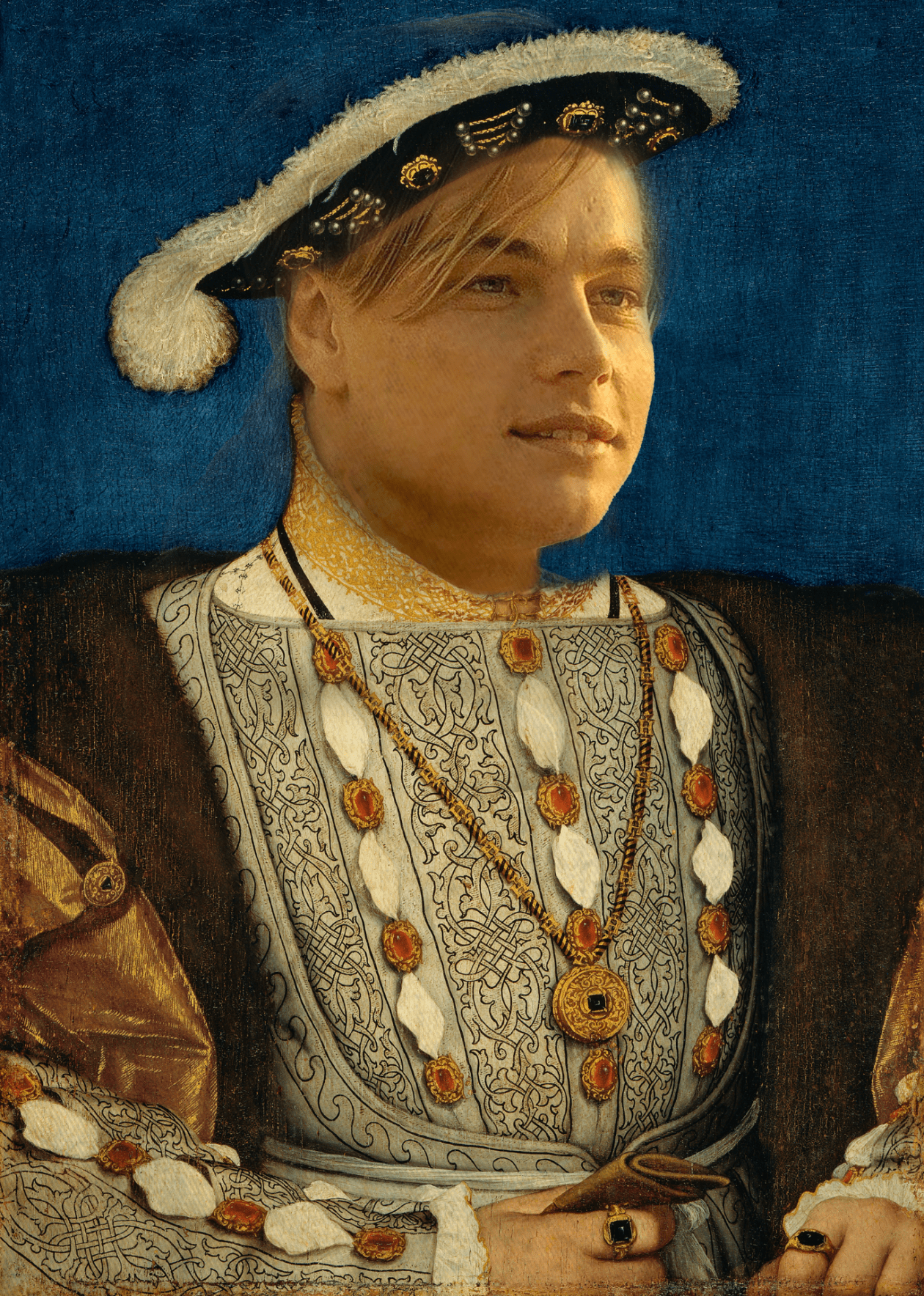
When first coming up with the idea of a composite image, I knew that I had to have an old English King. I first thought of the idea of doing the modern day English king, “King Charles”, then I realized other than their status of king, they have no similarities, and I feel like it would be too basic. I then thought deeper, and thought what was King Henry VIII for, and thought of all the wives that he had. I then asked myself the question: what modern day famous person is none for being with a lot of women, and immediately thought of Leonardo Dicaprio. Whenever I see images of him, I always see him with a different woman, so I knew that I had to put him down. I did the research on how many girlfriends Leonardo has had and the result came up as 19. So in conclusion, the reason why I chose these two is they both have been with a lot of women.
The advice I would give when come up with a composite image is be creative when coming up with a composite image because it will make the project much more enjoyable
One thought on “Too many to count”
I really like how the face matches the skin and structure of the original fine art photo. And how the color of the skin matches the original photo allows you to not make strange edits that mess with the color of the whole photo.
I think he could have done better when it comes to the hat. First of all the hat seems to be missing the top as it is covered by the blue background. Secondly the hair from Leonardo looks good from afar but up close it weirdly is detached from the point where the hat and forehead meet and also its possible to see the slightly translucent hair right above the ear, overlap the hat.
I would advise you to use a mask and completely get rid of the overlap of the hair and the slight extra around the ear. If you did this the hair would appear a lot more natural and overall the face would look more aligned. Also around the neck there is a very sharp edge between the clothes and the neck thus it looks out of place, a feathering of the edges would make it look better.
Noel Valente