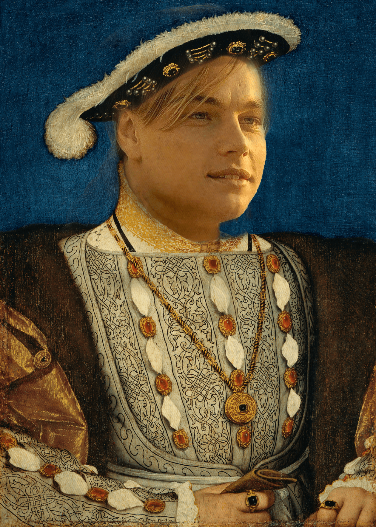
My heritage month poster features 7 time world champion Lewis Hamilton. Lewis Hamilton is a black Formula One Driver for Mercedes Benz F1 Team. He is the most winning driver of all time winning a total of 103 Grand Prixs, and is tied for most world championships with 7. I decided to name my artwork “Hamilton :Racing Royalty” The elements that are most obvious in my artwork are colors. The whole poster is filled with vibrant colors that jump out at you when you look at it.
The tools that helped make my artwork were Photshop and illustrator. In photoshop I had to mask the subject and remove the background. From there I positerized the image which breaks the image down into smaller levels. I then added a gradient map to the image which gave its colors. After that I dragged it into illustrator where I added my final touches to it such as the border, and the text displayed in the poster.
Selecting Lewis Hamilton as the subject for my heritage month poster was a natural choice, driven by my deep fascination with Formula One. Hamilton’s trailblazing journey in the sport, coupled with his unwavering advocacy for diversity and change, makes him an exemplary figure to celebrate. Through my art piece, I aim to capture not only Hamilton’s remarkable achievements on the racetrack but also his impactful contributions to promoting diversity within the world of Formula One.
My goals were to become more familiar with the two programs we use Photshop and Illustrator. I wanted to master more techniques so I could better understand the programs. I believe that doing this artwork helped me better understand the programs, especially AI as prior to this, I had not been able to navigate Illustrator.
My overall impression of this piece is that it was fun. I liked the final product that came out, and I had also learned a variety of new techniques. This will influence my future art pieces projects as I will now implement the techniques I learned in my future projects.
What is the type of business you designed your logo for? Explain.
The type of business that my logo is designed for hydration company named Vail Hydration.
How does the logo represent your business? Explain.
This logo represents my Business is that we are a healthy beverage company, and the image and message that I am trying to send through my image is that we are company that promotes earthy, crunchy vibes.
Who is the target audience for your business? Explain.
The target audience is for people who looking for a healthy beverage, while also being sastfied by the taste.
How does the logo appeal to that target audience? Explain.
Given that I am trying to appeal to crunchy/environmental aware people, I wanted to incorporate nature into my logo. So the use of Mountians and rivers in the logo, promotes that.
What are you the proudest of in this piece of artwork? Explain.
My proudest piece of this art work is how well the mountains went with the lettering. They contrast well together, and just go together really well.
What could you have done better? Explain.
I could have made the river a little more centered, as I felt I was in a rush when making it, and when finished with it I did not look to see if it look good.
What is the subject of your illustration and why did you choose it? Explain.
The subject of my Illustration was Barry Allen, The Flash from the tv Series The Flash CW. I chose this as The Flash used to be one of my favorite shows, and I felt as if this would make more a really good pictogram.
What do you like about your art? Explain.
I really like how simplistic my pictogram is, and that less is more. I also liked how well this portrayed The Flash, and if you were to take away the title, you would easily be able to tell what the pictogram is.
What advice would you give another student before they begin the pictogram technique? Explain. If I were to give advice to one doing this project, I would say to not be ashamed of tracing over a subject. Doing this will elevate your art, as it makes your art so much cleaner. This allowed me to focus more on my design than actually worrying about trying to make a good looking subject. One last piece of advice I would give is to mess around with different fonts, because although it’s only just writing, it’s the difference between an ok art piece and an amazing art piece.
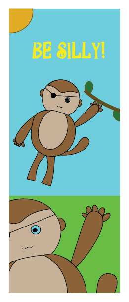
My artwork portrays two monkeys, having a wonderful time, with one swinging from a branch, and the other waving. The title I chose is “Monkeying Around “ and it emphasizes not only the playful nature of the monkeys but also highlights the joy and positivity you aim to bring to the children with cancer who will enjoy your artwork. It conveys a sense of adventure and happiness in a way that is both engaging and uplifting.
(How did you create your artwork)
This piece gained inspiration from a book that had numerous children’s drawings, and the book gave a tutorial on how to make them. I chose the monkey as when I broke it down, it seemed easy to draw, as it was predominantly circles and two colors. This was made in Adobe Illustrator, and to make the actual shape of the monkey, I used the shape tool and used a lot of circles to construct this monkey. The background was quite simple and consisted of two colors, one being green for the grass, and the other being blue for the sky. Going through this process, I was going by the saying, “Less is more”, as simple can look much better.
(What was the big idea)
The main idea behind this piece is to keep things simple and cheerful. I used basic shapes and bright colors which created a joyful scene that brings joy to whoever has this card, or even someone who glances at it. By making my artwork simple, I attend the piece to be easy to connect. In addition to that, I chose to use the uplift message of “ Be Silly” in hopes of brightening the kid who is receiving this card. I intend to make this a card that kids may laugh at, or at least find joy from as the art portrays two monkeys, who both have eyepatches. Combined with cheerful monkeys, vibrant colors, and an uplifting message, this artwork serves as a beacon of cheerfulness, positivity, and inspiring joy in others.
(Goals)
My goals for this project were quite simple. I wanted to display an image that kids could laugh at, and find joy from. These kids are going through indescribable things that no kid should ever have to experience, and yet they’re so strong and brave. Through my artwork, I wanted to give these kids a break from their challenges, and a chance to laugh and enjoy the playful monkeys. I believe that even in tough times, moments of joy can be really powerful, helping them stay strong and hopeful.
(Overall thoughts)
Overall, I really enjoyed doing this project. I believe that this is one of the better projects we have done, as it is going to be a great cause. Throughout the project, I found joy in making this, as I imagined the kid who receives this card with a big smile on their face. This was my first time using illustrator, so I also enjoyed this as I worked on a program that is new to me, and from this project, I was able to grasp the basics of illustrator, which will help me for the foreseeable future.
1.Which is your favorite portrait photo that you took? Why?
My favorite photo I took is the loop lighting. What I like about the photo is the effect the lighting has on the face, and It just fascinates me that different angles can completely change a photo.
2.Which of these lighting techniques do you think you can apply for future picture taking? Explain.
I think for the future, I can apply for the future is split lighting. This adds a drama to the picture, and it also highlighting the details on the skin and the hair.
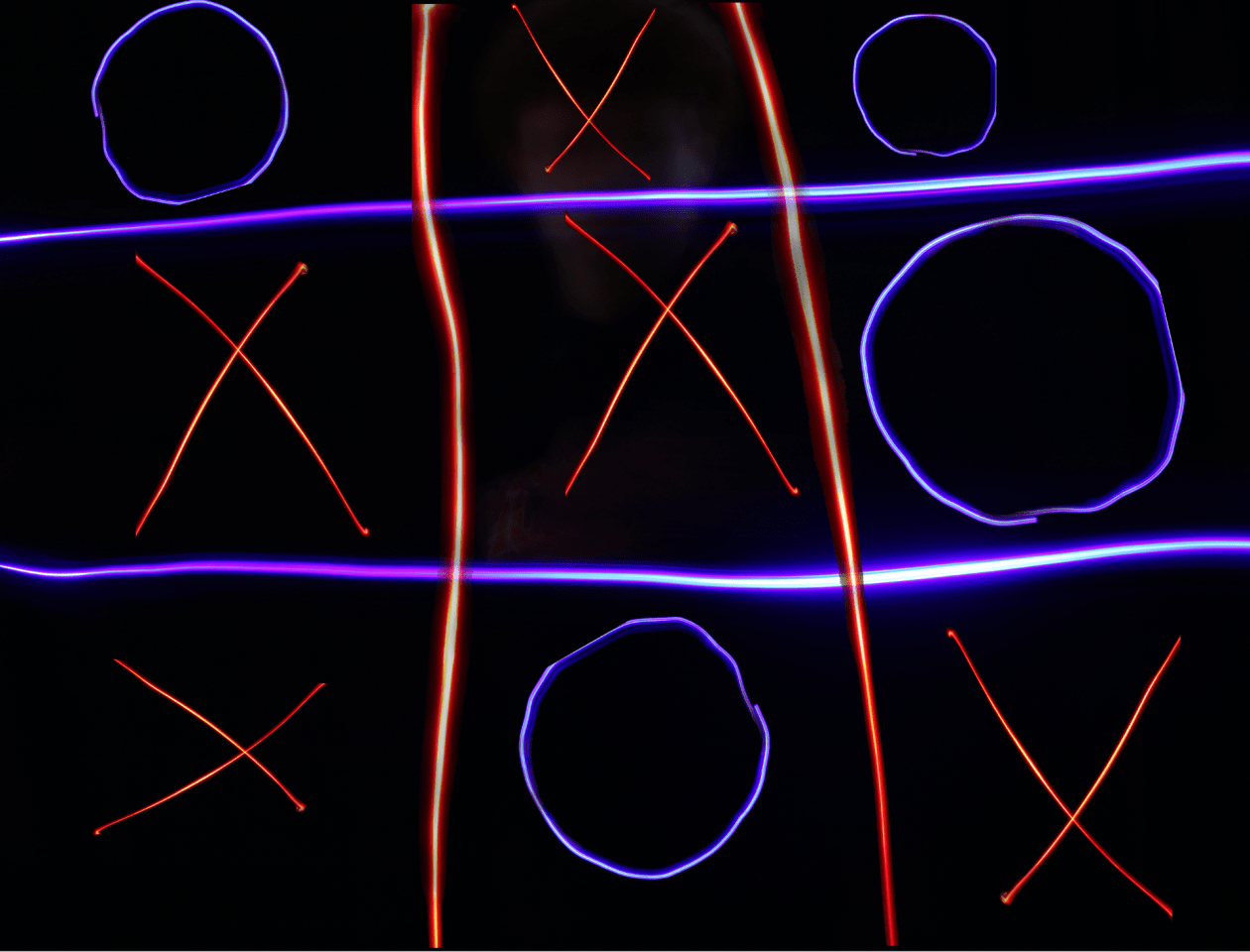
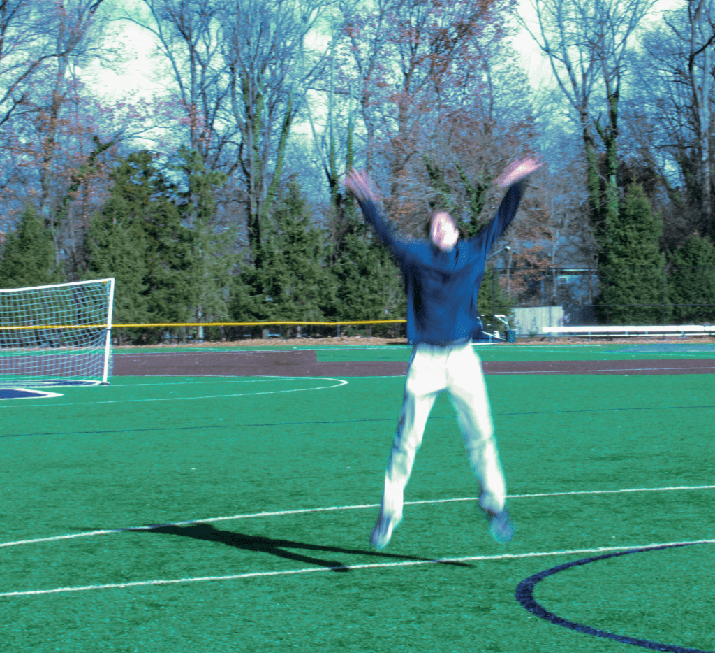
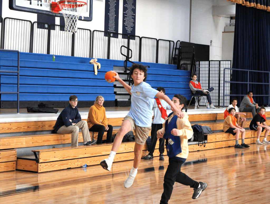
Light Art 6.2 sec; f/11; ISO 100Motion Blur 1/25 sec; f/32; ISO 400;Frozen 1/400 sec; f5/6; ISO 3200;
Advice I would give to people doing this project is to take multiple photos or as many as you can. You can also try different angles, and different camera settings to see which one works best. When taking photos it is always better to have more pictures, as you have more options to choice from, when coming up with a final product.
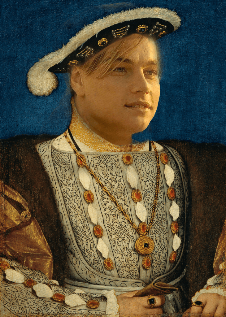
When first coming up with the idea of a composite image, I knew that I had to have an old English King. I first thought of the idea of doing the modern day English king, “King Charles”, then I realized other than their status of king, they have no similarities, and I feel like it would be too basic. I then thought deeper, and thought what was King Henry VIII for, and thought of all the wives that he had. I then asked myself the question: what modern day famous person is none for being with a lot of women, and immediately thought of Leonardo Dicaprio. Whenever I see images of him, I always see him with a different woman, so I knew that I had to put him down. I did the research on how many girlfriends Leonardo has had and the result came up as 19. So in conclusion, the reason why I chose these two is they both have been with a lot of women.
The advice I would give when come up with a composite image is be creative when coming up with a composite image because it will make the project much more enjoyable
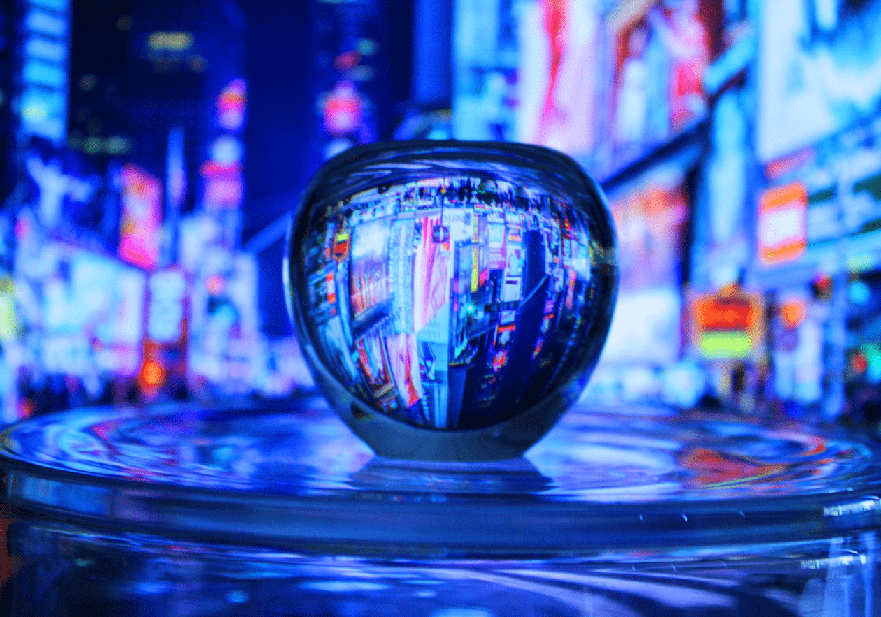
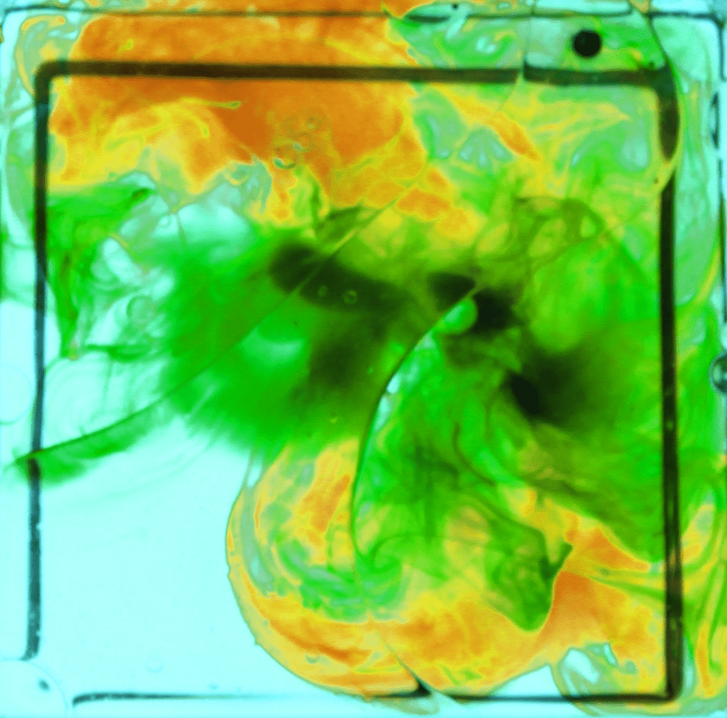
The distinct mood for the refraction image is one of vibrant energy. The colors, particularly the bright and lively tones, evoke a sense of excitement and intensity reminiscent of the city skyline. The play of light and shadow, along with the dynamic lines and shapes, contributes to an overall feeling of movement and activity. The presence of the vibrant lights gives a touch of liveliness and really gives that NYC feeling
What does the photo make you think about? When I thought about the refraction photo, New York City’s Times Square at night immediately came to mind. I aimed to create an image that makes viewers feel like they’re right there in the heart of Times Square. I think this photo really achieves that.
What in the photo jumps out at you? Explain.
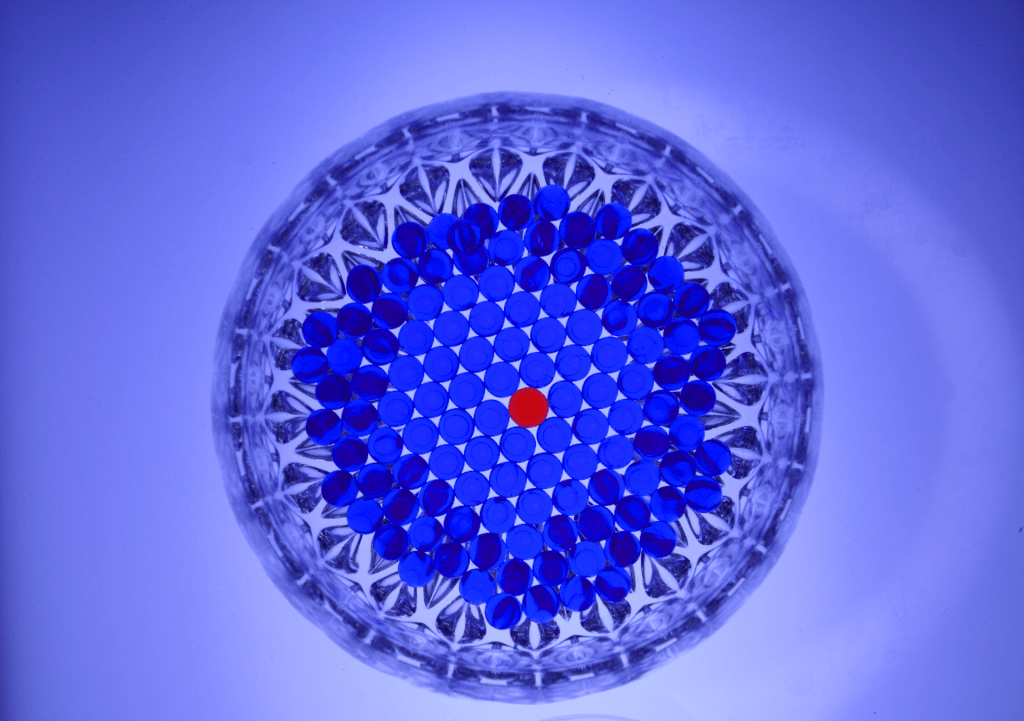
For the water beads photo, the thing in the image that really jumps out at me is the one red water bead in the center of the bowl while it is being surrounded by a bunch of blue water beads. I was going for what in photography is called, “Break In Pattern”. I wanted the viewer to focus on the red water-bead in the middle, and I think that by surrounding it with blue water-beads.
How does the photo make you feel? Explain.
In the shadow photo, for some reason I feel a sense of comfort. The glass figure in the image reminds me of an igloo, and that reminds me of the winter time. The blue that is reflected from the lamp also gives off a sense of comfort, as that also reminds me of the winter. It’s as if the photo has captured the essence of a tranquil, snowy retreat, inviting a nostalgic embrace of comforting moments in the heart of winter.
What advice would you give to next year’s students for shooting abstract photography? Explain.
For captivating abstract photography, take photos from unique angles, and make sure to put an emphasis on capturing lines, shapes, and textures. Experiment with different light and shadow, play with motion, and utilize reflections to add a touch of surrealism.
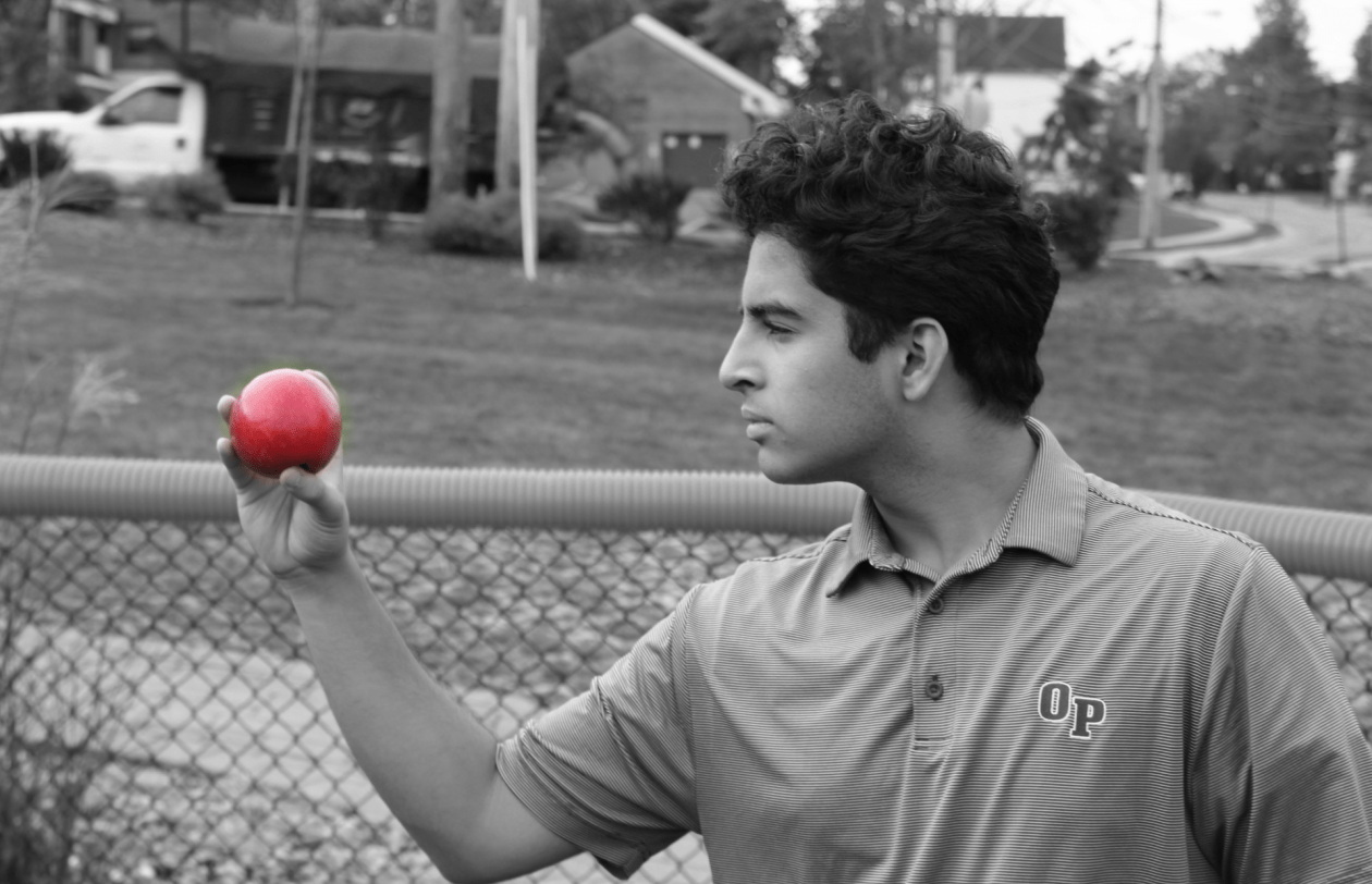
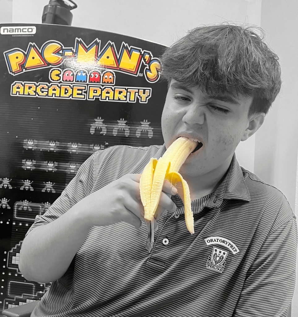
Q1 How did you choose the specific types of food for each portrait? What is their significance? Explain – be specific! (3 sentences min.)
The reason I chose the banana is because that is what Noah had in his lunch box. I also chose this picture because it contrasted really well with the background, of it being packman. I picked the apple because I am allergic to those, and I thought it would be a good idea for my model (Aryan) to stare at it intensely.
Q2 Consider the lighting in your photographs. What was the light source in each of your photos. What time of day? How did it affect the mood and atmosphere of the portraits? Explain – be specific! (3 sentences min.)
In the first image, the lighting was from the lights that were on in the senior lounge, and also we were in a room with no windows. This lighting affected the mood of the photo as I was able to get both the background and the model, and it came out with good results. In the second photo, there was light all around as it was the middle of the day, it would also be important to mention that this photo was taken when it was party cloudy. Similar to the first photo the lighting affected the mood and atmosphere as everything was able to be seen.
Q3 Think about the composition of your photos. Name the composition technique you used for each photo. Why did you choose to crop your photos as shown? Be specific! (3 sentences min.)
The composition technique that I used was “Rule of thirds” and that would apply for both of the photos I took. In the first photo, I set and cropped the image so that the focus would go the pac-man. As seen in the photo the Pacman is eating the ghost and when you look to the right, next up is the Banana, as that is one of the things that he eats in the game. Rule of thirds was also demonstrated in the apple photo, as I wanted to main focus to be on the apple, as that was main subject in the photo.
Q4 How do the colors and color splash technique in your photographs contribute to the overall impact of the images? Why did you choose to mask the specific areas in color for each photo? Be specific! (3 sentences min.)
The color and color splash technique contributed significantly to the photos. I chose to stick with the yellow theme in first photo. I originally just had the bannaa masked, but then I thought to myself that since the pacman was in the back, and it was also yellow, that it would make the photo even better. For the second one, I enchaed the apple to be even more red so that photo came out better.
Q5 Consider the technical aspects of your photography, such as focus (lens size 75-300(lg) or 18-35(reg), or iphone mode/focus), depth of field (blurry background), and exposure (value in PS adjustment of your black, grays, whites). How did you use these techniques to enhance your images? Be specific! (3 sentences min.)
I lens I used for the apple shot was a 18-35 lens. I wanted a large depth of field as I wanted the model and his apple in his mand, but I also wanted for the background to be visible and apart of the shot. For the second photo, I used a I phone camera on focus mode. Q6 What advice would you give to next year’s students for shooting food portraits? Be specific! (3 sentences min.)
Fir next year students, the advice I would advice is to be creative. If you have an idea for a photo, take it and take as many shots as possible. You can never take to many photos, but you can too little.
TextureClose UpShape OrganicLine Man MadeLine NaturalBlack and WhiteGeometricColorformSmall Depth
1. What strengths and weaknesses do you see in your own work?
One of my straights is that I take a lot of pictures when I am out there. If I see something that I like, I will take a picture of it. The weakness that I posses, are not really knowing what to do in Photoshop. I would often find myself opening a picture, and not knowing what tools to use in Photoshop.
2. How might you improve or refine your approach in future photography projects? In the future, I want to improve my skills in photoshop so that I can truly bring out the best in my work. I will also hope to take in account for lighting, and what makes a good photo, and what makes a bad photo. I also want to try different angles because a angel can really change a photo.
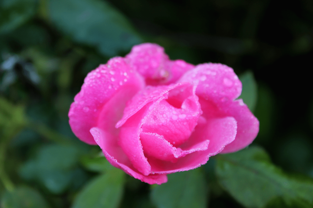
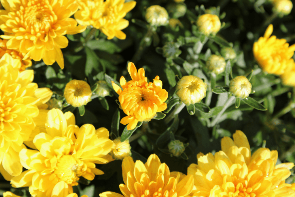
3. Pick one of your photos, what emotions or messages did you intend to convey through this photograph? For color, I tried to convey the emotion of happiness. When I saw those flowers, it gave me a sense of joy, and happiness. The bright yellow reminded me of a smiley face, so that is what I intended to do with that.
4. Are there specific elements of art you would like to explore further in your photography?
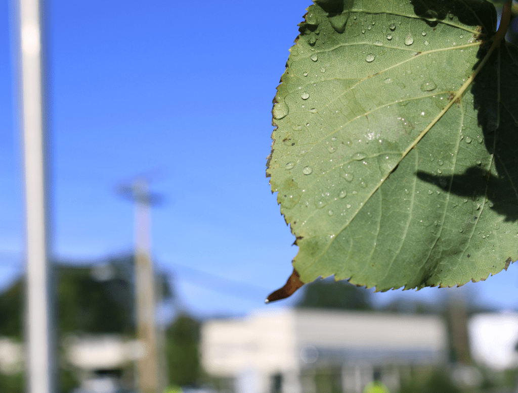
Yes, one element of art I would like to explore in the future would be lines. Lines man made, or natural really make more a interesting and great photo. I just think there is so much that you can do with these, and those always seem to turn out great.
5.What concepts or techniques do you want to experiment with in your next project?
As mentioned above, I would like to dive more into the lines and see what I an make with those. I would also like try different angels and see how my photos turn out. Lastly, I would like to improve my photoshop skills as I feel it will take my photos to the next level.