


What is the distinct mood of the photograph?
The distinct mood for the refraction image is one of vibrant energy. The colors, particularly the bright and lively tones, evoke a sense of excitement and intensity reminiscent of the city skyline. The play of light and shadow, along with the dynamic lines and shapes, contributes to an overall feeling of movement and activity. The presence of the vibrant lights gives a touch of liveliness and really gives that NYC feeling
What does the photo make you think about? When I thought about the refraction photo, New York City’s Times Square at night immediately came to mind. I aimed to create an image that makes viewers feel like they’re right there in the heart of Times Square. I think this photo really achieves that.
What in the photo jumps out at you? Explain.
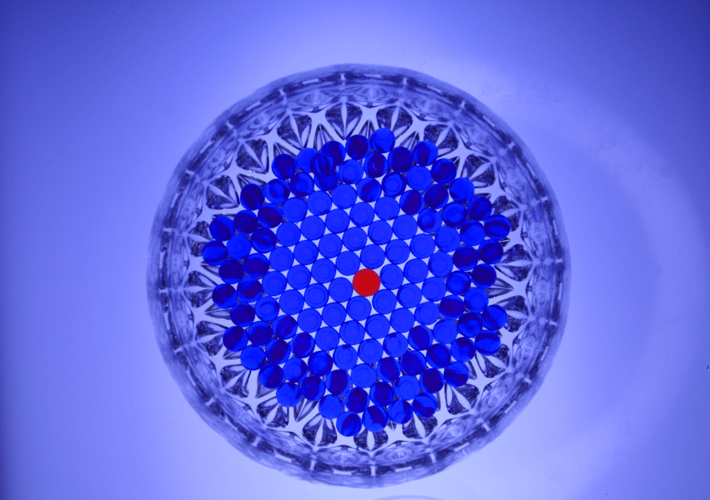
For the water beads photo, the thing in the image that really jumps out at me is the one red water bead in the center of the bowl while it is being surrounded by a bunch of blue water beads. I was going for what in photography is called, “Break In Pattern”. I wanted the viewer to focus on the red water-bead in the middle, and I think that by surrounding it with blue water-beads.
How does the photo make you feel? Explain.
In the shadow photo, for some reason I feel a sense of comfort. The glass figure in the image reminds me of an igloo, and that reminds me of the winter time. The blue that is reflected from the lamp also gives off a sense of comfort, as that also reminds me of the winter. It’s as if the photo has captured the essence of a tranquil, snowy retreat, inviting a nostalgic embrace of comforting moments in the heart of winter.
What advice would you give to next year’s students for shooting abstract photography? Explain.
For captivating abstract photography, take photos from unique angles, and make sure to put an emphasis on capturing lines, shapes, and textures. Experiment with different light and shadow, play with motion, and utilize reflections to add a touch of surrealism.
2 thoughts on “Colors That Pop: My Abstract Art World”
I love this image the most because of the feelings it displays. It gives a sense of being alone but surrounded at the same time. It is similar to when you are in New York City and there are lots and lots of people but they aren’t truly connecting.
This image could be better but in general it is splendid. For example he could make the image brighter in order to highlight the contrast between the colors even more. He could also have been more careful about the blue bead placement because they were all over rather than organized in a pattern.
One piece of advice I have for Seamus is to be a bit more meticulous. This is specifically in the water bead section he could have added more of the blue beads. This would have made the image look more full and complete.
Aryan
This picture is really cool, probably one of my favorites that I’ve seen in my time in digital photography. I love how it looks like the ball is surrounded by the city and reflects the city perfectly. It really feels like there is a city around the ball, everytime I look at it I can’t help but think that it was taken in a bustling city.
The one thing I think could be better, is the placement of the photo and the sphere. The only thing I see wrong with the photo is that you really can’t see the full image, I didn’t even realize there were people walking in the photo which really adds to the photo. I think it would really add to the photo if you adjusted the background a little bit.
Some advice I would give to seamus is not being afraid to switch it up. You might have one idea and you think it’s really good, but trying another angle or another background image could end up being really good. Trying something you normally wouldn’t could lead to you wanting to do things differently than the norm.
Dean Webber